visualizations
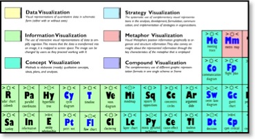
Periodic table of information visualizations
11/11/09 10:09
This is cool! Each box pops up
and shows you a sample image!
The Word Train
04/08/09 10:15
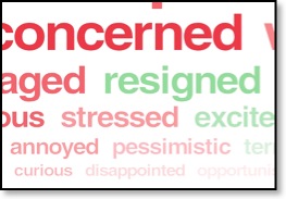
The New York Times is asking how you feel about the economy, and showing the results as a word train.
Evir connection visualizations
03/25/09 10:51
The
Washington Post has started adding Evri connection maps to its
articles. There are still a lot of gaps in its
searches, but this is an interesting tool to play
with. Here's a sample. Clicking on each circle takes
you elsewhere.
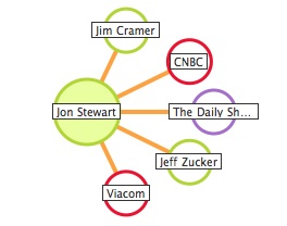
Nice representation of related terms, narrow terms, and identifying connective words. It's not a strict taxonomy, which would label the connections with broader, narrow, or other identification of the relationships, just showing relationships.
Nice representation of related terms, narrow terms, and identifying connective words. It's not a strict taxonomy, which would label the connections with broader, narrow, or other identification of the relationships, just showing relationships.
Make words out of books
03/24/09 09:16

Media Cloud Visualizations
03/20/09 11:16
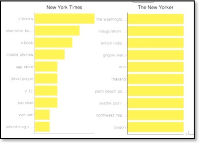
The Media Cloud Project allows you to input several data sources, like the New York Times, and create a visualization of the most frequent words, or the words most often associated with a term you enter. Quite interesting. The graph above was for a search on most-related terms for "books."